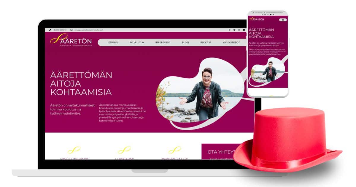
The connection with Anu was made during an evening event organized by a mutual acquaintance, and we later met again for a planning meeting. Anu’s old website desperately needed modernization and a refreshed appearance, as the existing blue-yellow color scheme and sunflower imagery did not convey the essence of coaching and training in 2022.
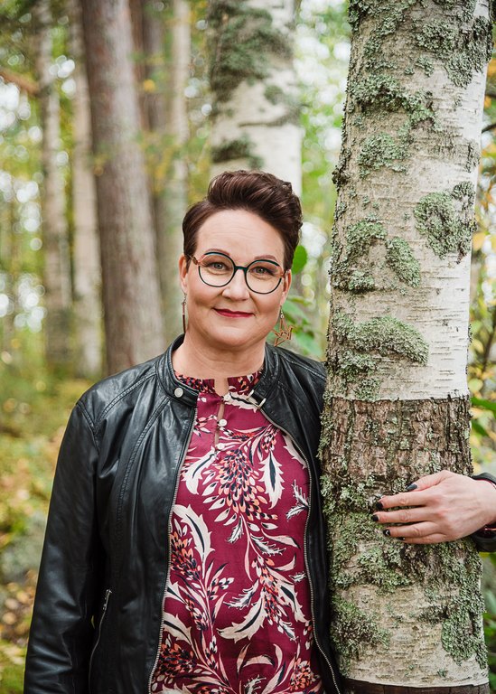
I was given a lot of creative freedom with the design. Jenora Design (link to the reference presentation) provided beautiful photos that highlighted Anu’s warm and approachable personality. From these photos, I selected three main colors for the website: cool burgundy, light gray, and pure yellow. I also designed a new logo for the company, using its graphic element as a visual effect on the site. The text content was copied from the old site, and some parts were rewritten by Anu.
Anu Ojanperä, Koulutus- ja työhyvinvointipalvelu Ääretön Oy
From the very first meeting, I noticed that Annika genuinely stopped to listen to and understand my wishes for my website. She immediately came up with some great ideas (e.g., the color scheme of my site) that were refined and implemented as the project progressed. Building the website was much easier for me than I had anticipated. While working on other tasks, I wrote the texts section by section, and Annika professionally took care of everything else! She truly knows her stuff, and you can trust her with the job! Annika’s way of presenting her opinions and ideas is appropriately bold and respectful of the client.
It was important to me that my personality traits of warmth and courage were reflected on my site. Annika succeeded excellently in this! My site turned out just the way I wanted, and whenever I visit it, I think, “What a nice site!”
The price-quality ratio was really good, and the site was completed on schedule. It’s nice to direct my clients to my site to get more information about my company, knowing that the site is presentable and professionally made. I often hear feedback from my clients saying, “What a nice site you have!”